Case Study 02
Reimagining how clients discover their next investment.
A brand new discovery experience for self-directed investors who needed inspiration, not just a search bar.
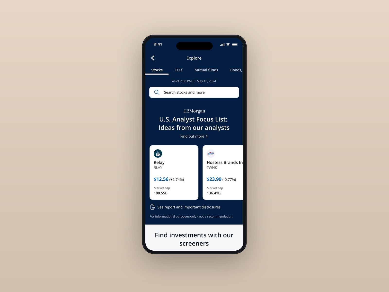
A brand new discovery experience for self-directed investors who needed inspiration, not just a search bar.
I led the design and experience of a brand new product that allowed clients to discover and consider new investment ideas. Partnering with research, analysts, and engineering, I built a curated browsing experience for clients who needed inspiration, not just a search bar.
Clients were trying to find investment ideas to build wealth in today's market. The only experiences available required clients to know which ticker and which criteria to search for ahead of time. Self-directed investors who came in with conviction were served. The clients who needed inspiration had nowhere to go.
The previous experience funneled every client through a single "Find Investments" tile. Once inside, they landed immediately on a screener tool that assumed a high degree of investment knowledge. Clients who came in with conviction were served. Clients who needed inspiration hit a dead end.
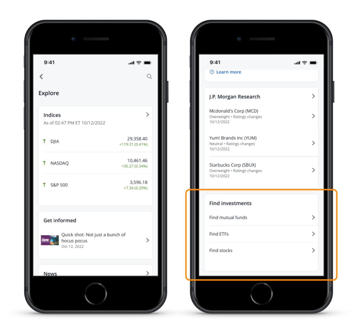
My initial approach pulled from familiar patterns — themes, news, today's movers, events, screeners. Content that already existed elsewhere on the app, just reorganized on a new page. Nothing technically wrong with it. But it wasn't different. It wasn't solving the discovery problem. It was assembling what already existed.
That realization pushed me to look elsewhere.
Design leadership kept using the word "browse." I kept turning it over. Then I stopped treating it as a design brief and started treating it as a real question: how do I actually browse something?
Shopping and streaming came to mind immediately. The goal was identical — helping someone discover something new when they don't yet know what they want. The shared pattern was curation, categories, and editorial framing over filters. That reframe redirected the whole product.
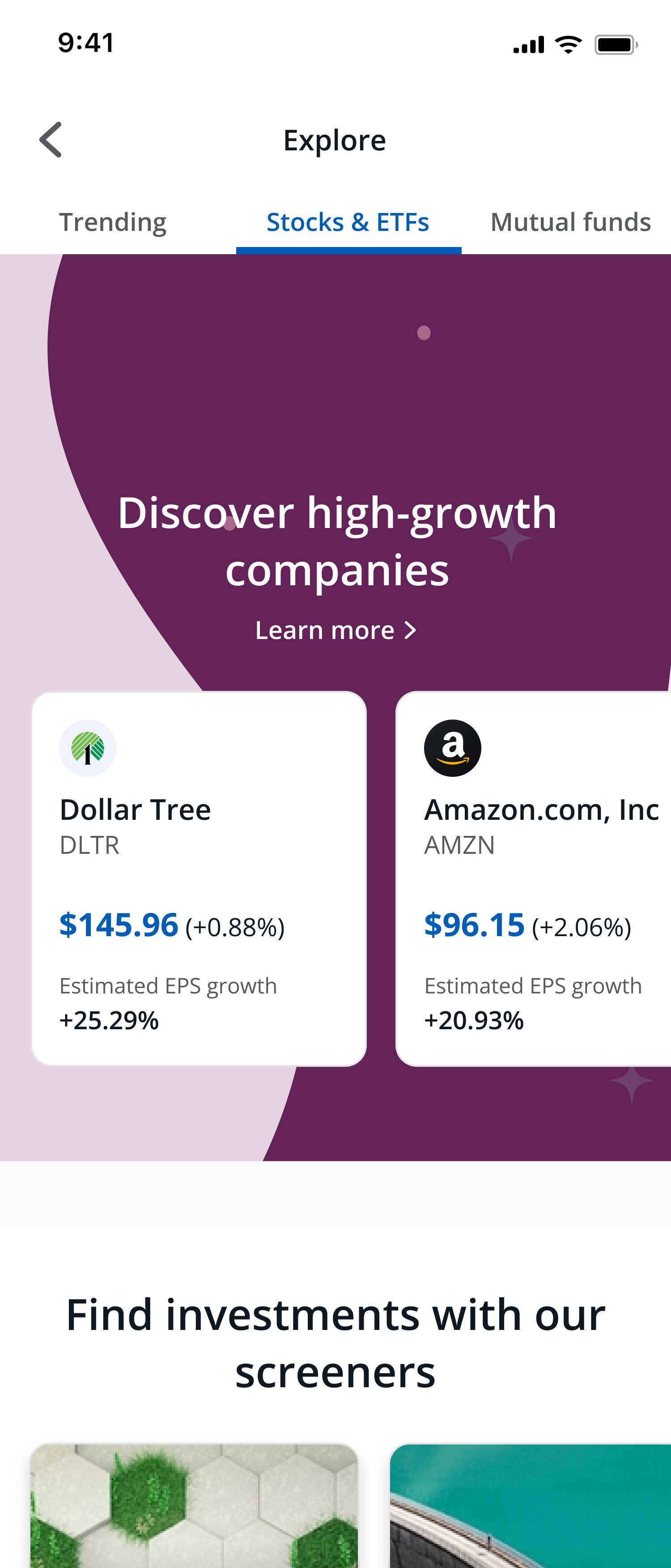
I knew I wanted to surface curated ideas but didn't know which framing would resonate. I tested three directions and let clients tell me which felt trustworthy.
Getting the analyst-curated lists into the product required aligning Brand, Asset Management, and Legal — three teams who each had a legitimate stake in how proprietary content was presented. The lists needed to feel differentiated without crossing into recommendation territory.
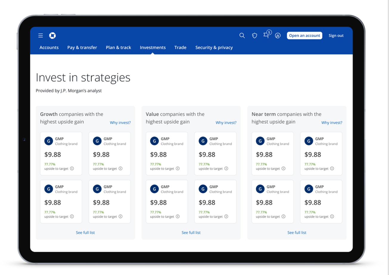
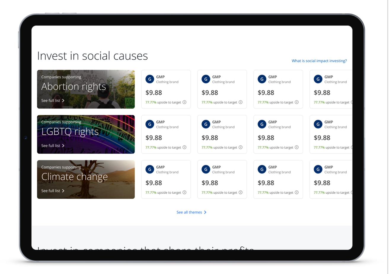
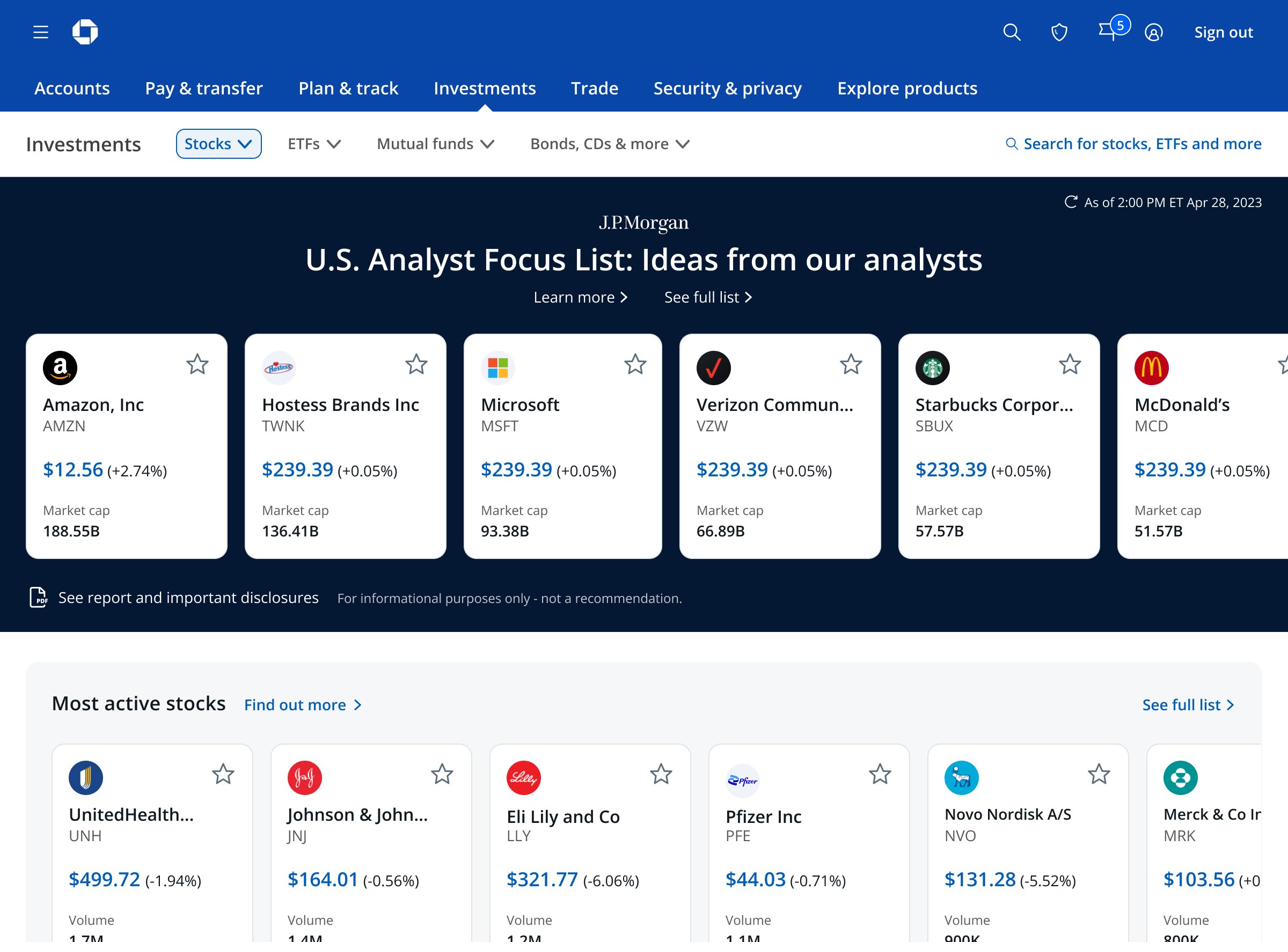
Getting the analyst lists to visually stand out required a non-standard background color. Brand doesn't allow differentiated backgrounds outside of the dashboard — I went through many iterations with their team before finding a path forward.
Eventually I found a color already in use on one of our existing dashboards. Combined with Asset Management's desire to make their content feel differentiated, I had both a precedent and a business rationale. The argument that landed wasn't "this is better design" — it was "here's proof it already exists, and here's why the business needs it."
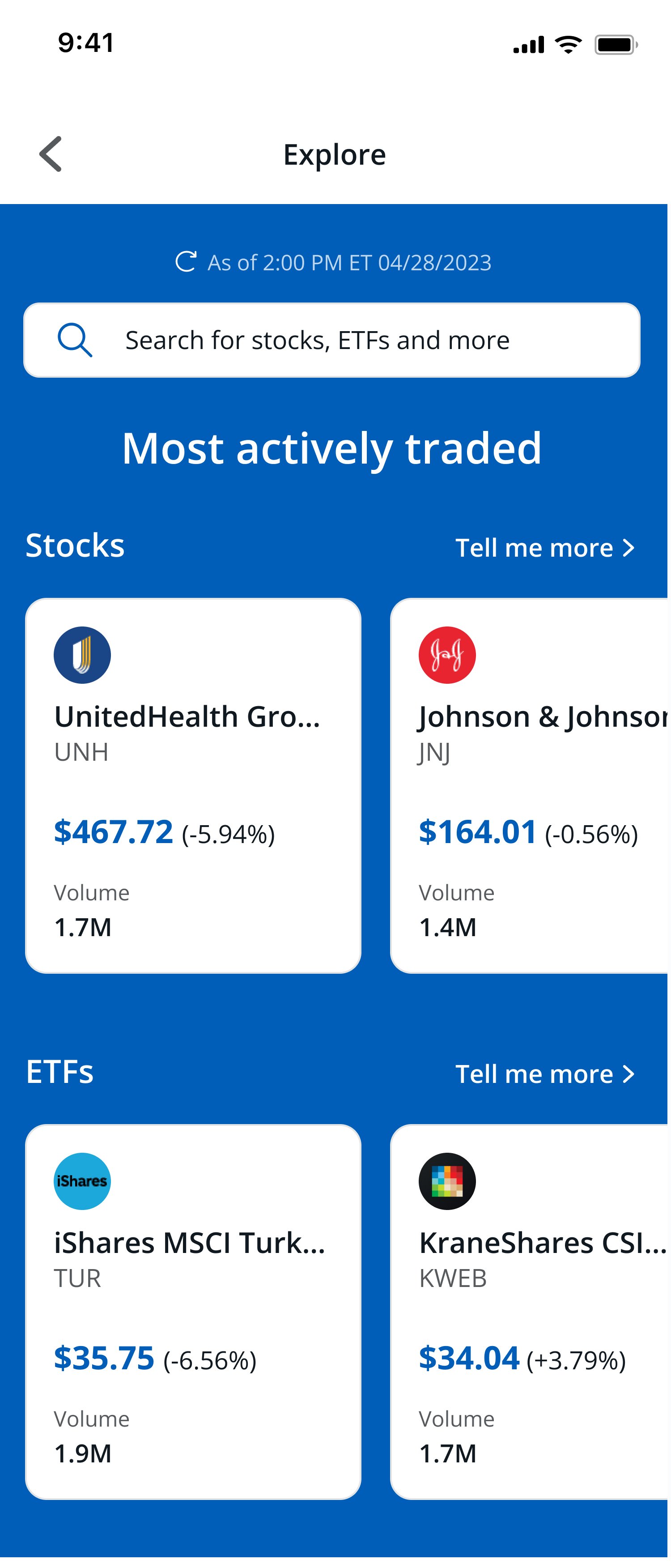
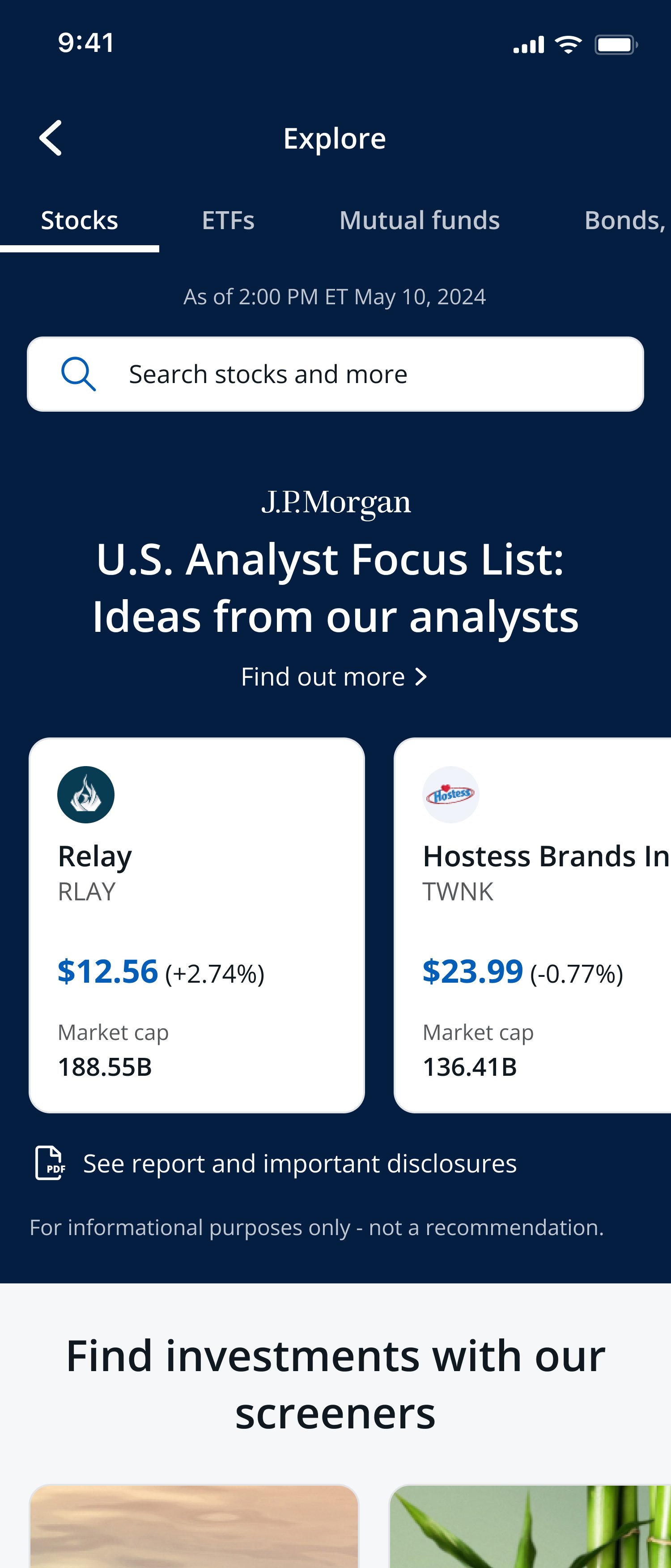
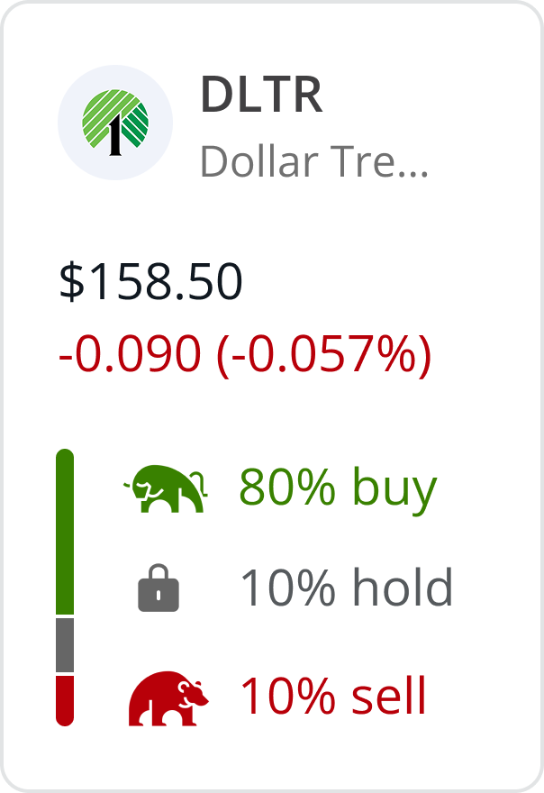
Testing also surfaced something I hadn't fully anticipated. More novice investors wanted to feel grounded before starting their journey. I built an education layer called "Find out more" that lives alongside each list — covering how it's compiled, what matters, the risks, and key metrics.
It also pulled double duty. Legal required that nothing in the experience read as a recommendation. The "Find out more" layer — which I had already planned for client value — satisfied that requirement without adding a separate disclaimer. Building it for the client first meant it worked for legal too.
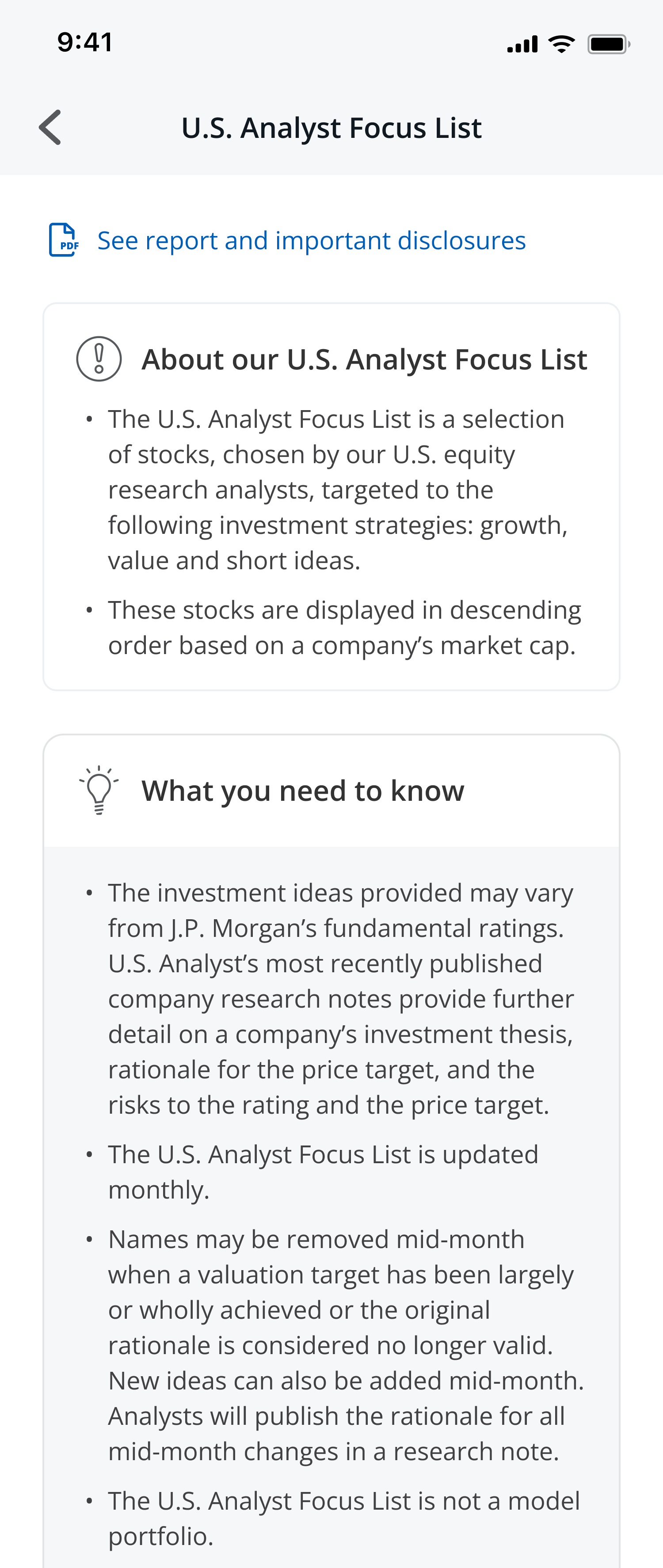
I wanted a third attribute on each tile — something beyond price that helped clients make a faster judgment at a glance. My first instinct was analyst ratings. I tested it. Clients didn't understand the internal language we were using at Chase, and from a legal standpoint we couldn't simplify the terminology.
No pressure to ship it. I made the call and moved on. I pivoted to category-relevant attributes — market cap, 1-year return, expense ratio — working with subject matter experts to identify what mattered most per asset class.
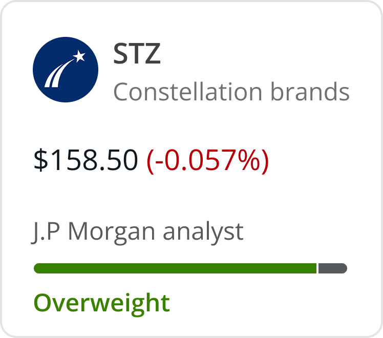
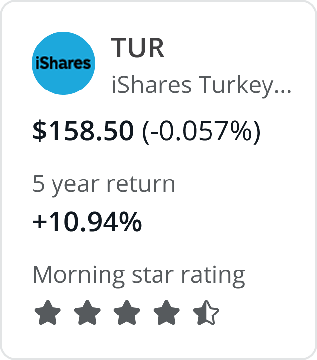
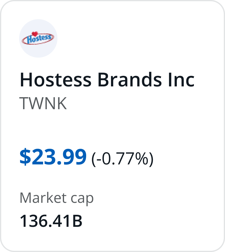
A discovery-first home, analyst-curated and strategy-based lists, and an embedded education layer for clients who want to go deeper before they commit.
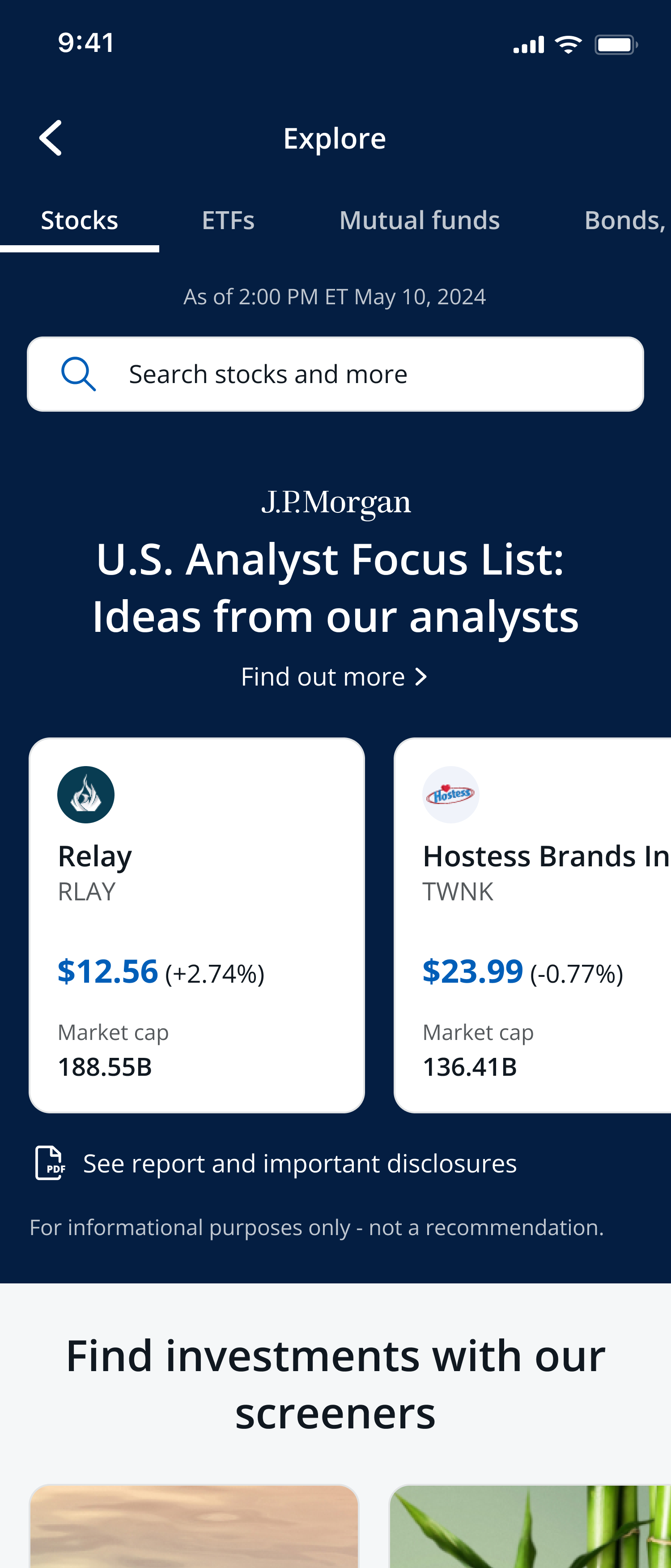
A discovery-first home with curated lists surfaced immediately.
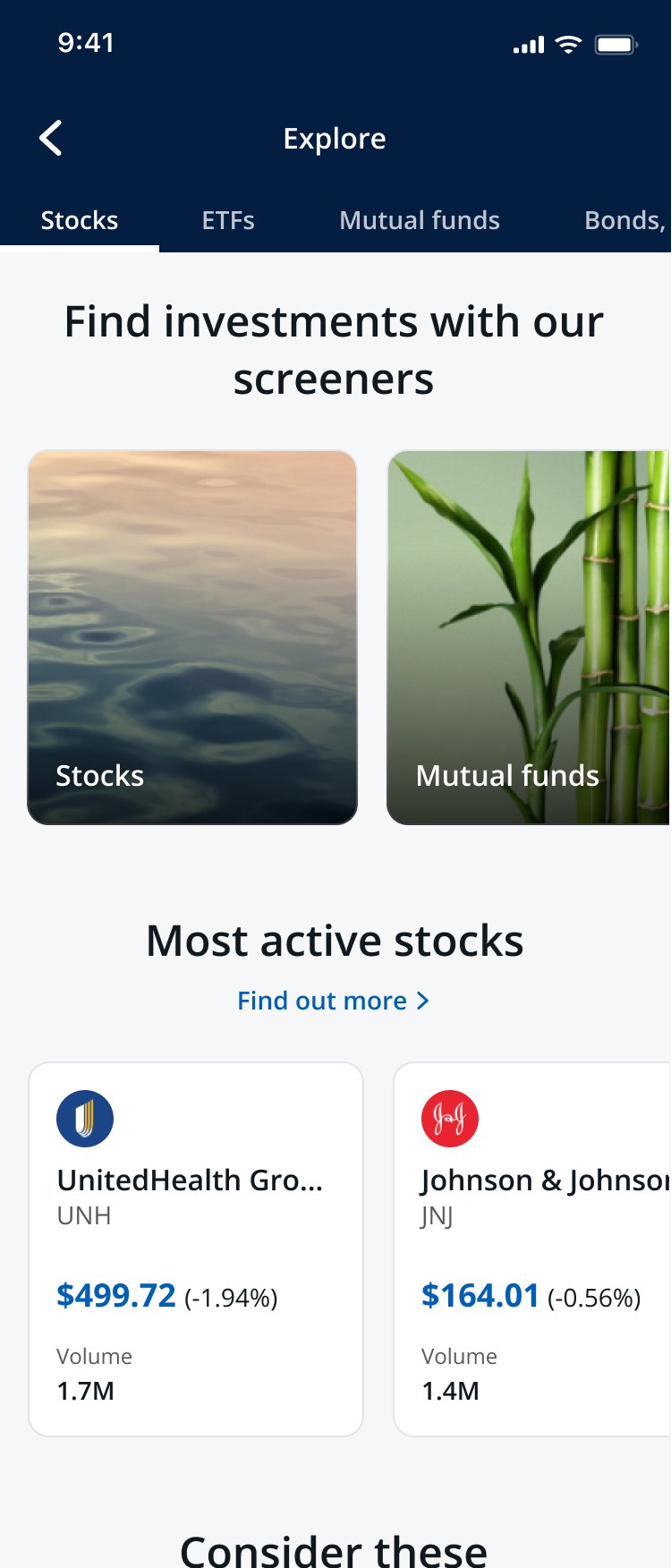
Browse by asset class and curated category.
Methodology, risks, and key metrics, available in context.
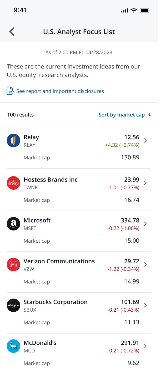
Ranked, sortable, with one tap to a quote.
My initial instinct was to place "Find out more" and "See full list" outside the carousel rather than inside it. I didn't push hard enough to test that specifically — I moved past the instinct instead of validating it.
Usage data eventually showed that clients were misclicking, confusing the two actions. I caught it and shipped the fix on web. But that should have been caught in testing before launch. It taught me to trust my instincts enough to test them rigorously, not just move on from them.
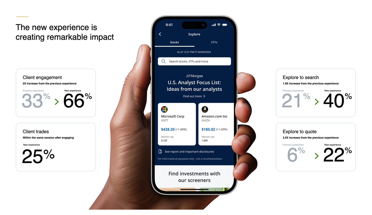
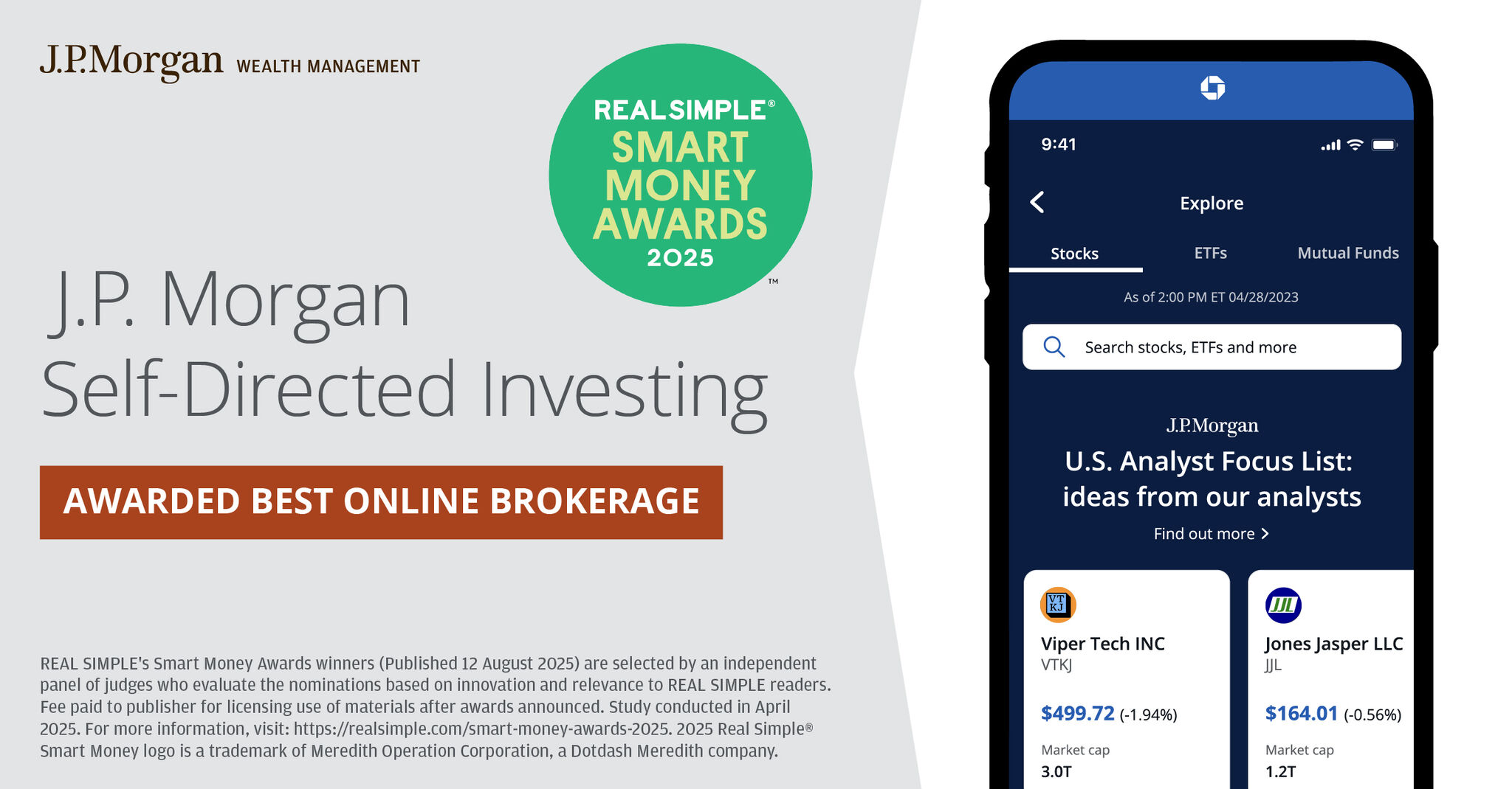
In 2025, J.P. Morgan Self-Directed Investing was awarded Best Online Brokerage in the Real Simple Smart Money Awards. The screen Real Simple chose to feature is from the Explore experience I led.