Case Study 03
Designing a savings account for the next generation.
Trump Accounts · 2025 to 2026
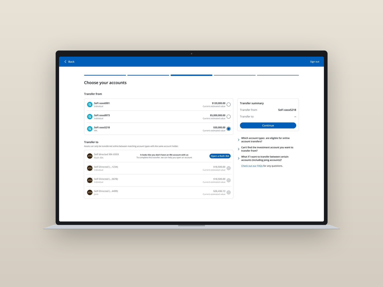
I co-led design and facilitated a fast-paced sprint to define how families would open, fund, and manage Trump Accounts on the JPMorgan platform. Working alongside leadership across product, design, and tech, we produced an end-to-end vision that was pitched to the U.S. Treasury. The designs set the foundation for what is now in build and slated to ship Q4 2026.
The One Big Beautiful Bill Act created Trump Accounts: a tax-advantaged investment account for every American child, with a $1,000 Treasury seed for eligible kids born 2025 to 2028. Treasury set the rules, but the experience for the parents who'd actually open and manage these accounts didn't exist yet. Every brokerage was racing to define it, and JPMorgan needed a vision in days, not quarters.
With a two-week window, I facilitated daily working sessions across product, design, tech, marketing, and compliance. The structure was deliberate: map what was unknown, what was legally required, and what was open to design.
Compliance flagged the IRS rules early. Marketing held the line on the parent's mental model. Product framed the build constraints. Decisions were made in the room, captured on the wall, and carried into the next session, so we never lost a day to async alignment.
The majority of clients coming to this product would be unfamiliar with investing. That shaped everything. Before a single screen was drawn, I aligned the team on four things the experience had to get right.
Two designers worked in parallel. I owned the dashboard, onboarding, and strategy selection flows, and defined the narrative arc of the pitch — sequencing the experience to tell a coherent story to leadership and the U.S. Treasury.
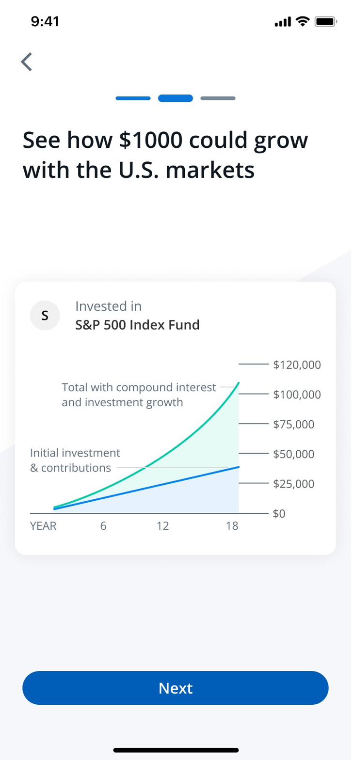
Lead with compound interest, not IRA mechanics. For a parent who has never invested, the hook is simple: put money in, leave it alone, and time does the work. A head start for your child, not a tax-advantaged account.
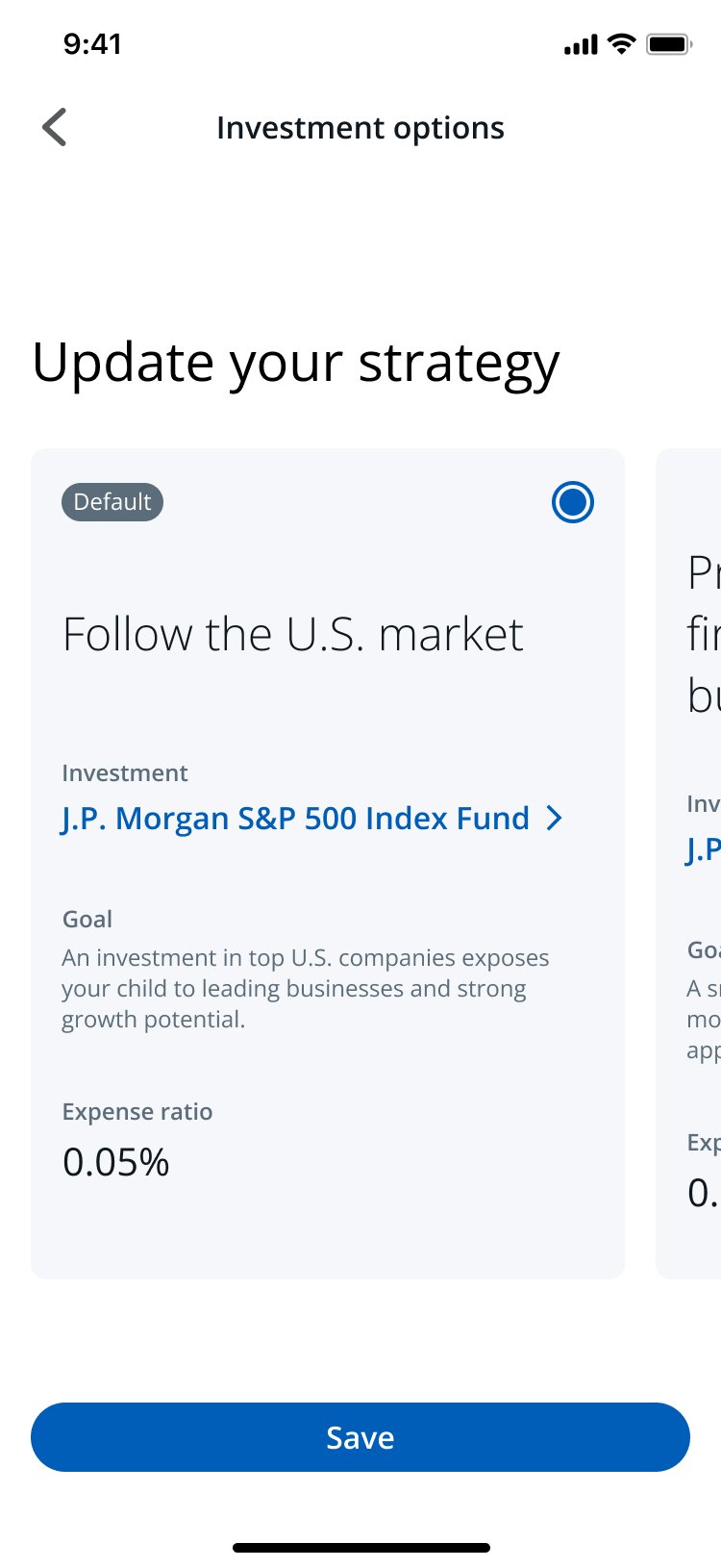
Three tracks mapped to goals parents already understood: growth (S&P), education-focused, retirement-focused. A real decision without requiring investment knowledge to make it.
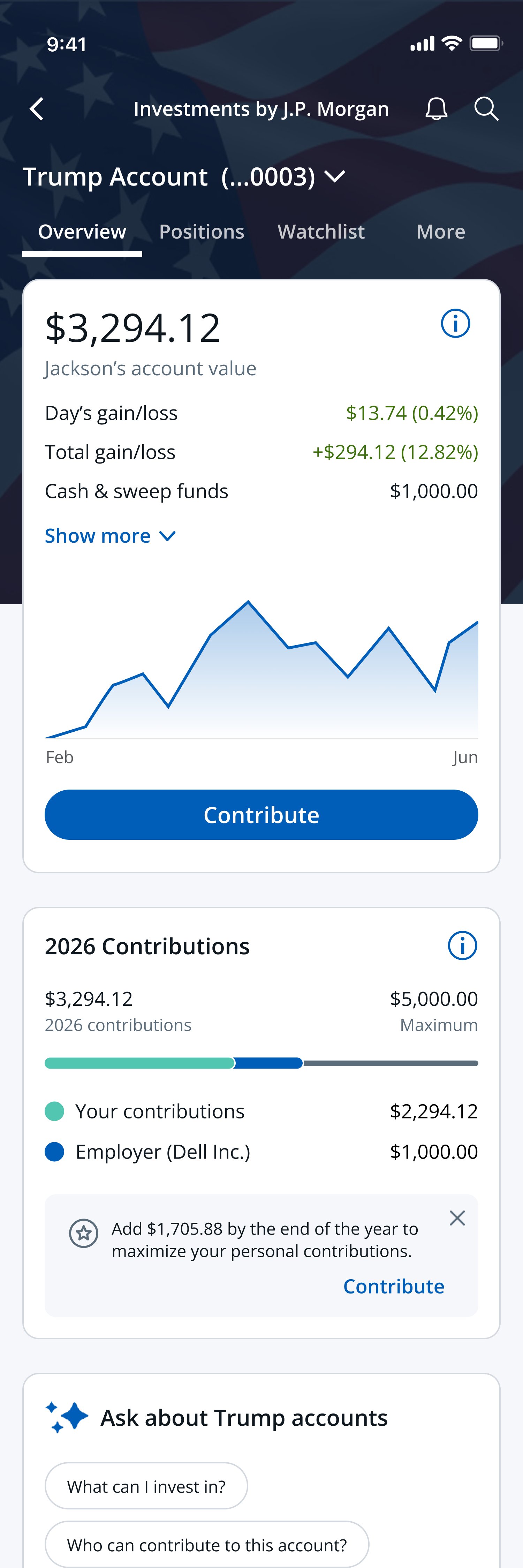
Four components a first-time investor needs to feel confident: balance, contribution tracking by source, holdings, and an AI FAQ. Selected from existing patterns, not reinvented.
With a two-week window, every decision about what to include had to be deliberate. Two flow directions were explored and challenged — one shaped how clients enter the experience, the other was removed from the pitch entirely.
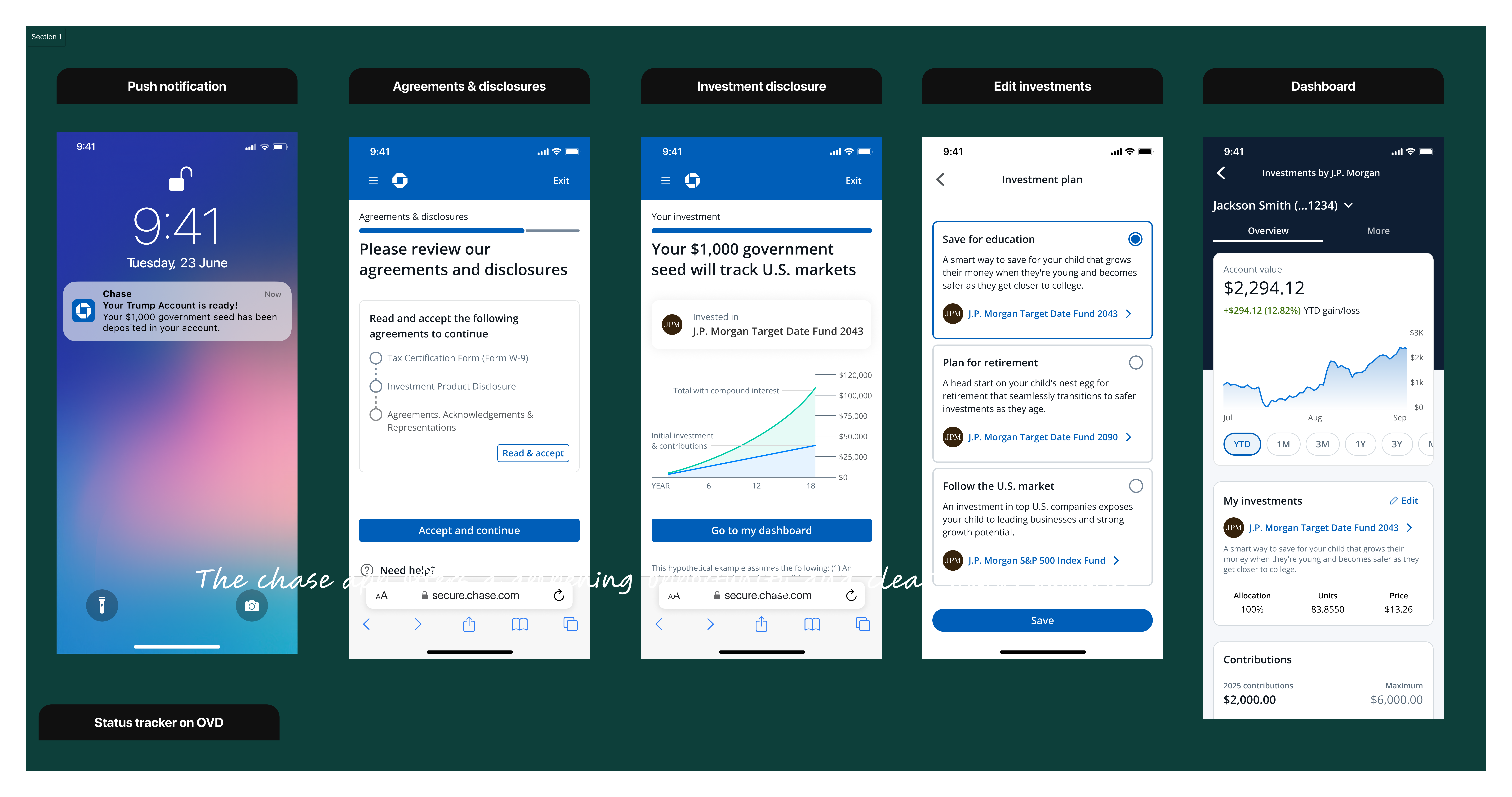
An early direction put strategy selection inside onboarding. I pushed back — a first-time investor shouldn't have to choose how their child's money is allocated before they even understand what the account is. Moved it to a post-open option they could revisit later. Get them in first. Give them control when they're ready.
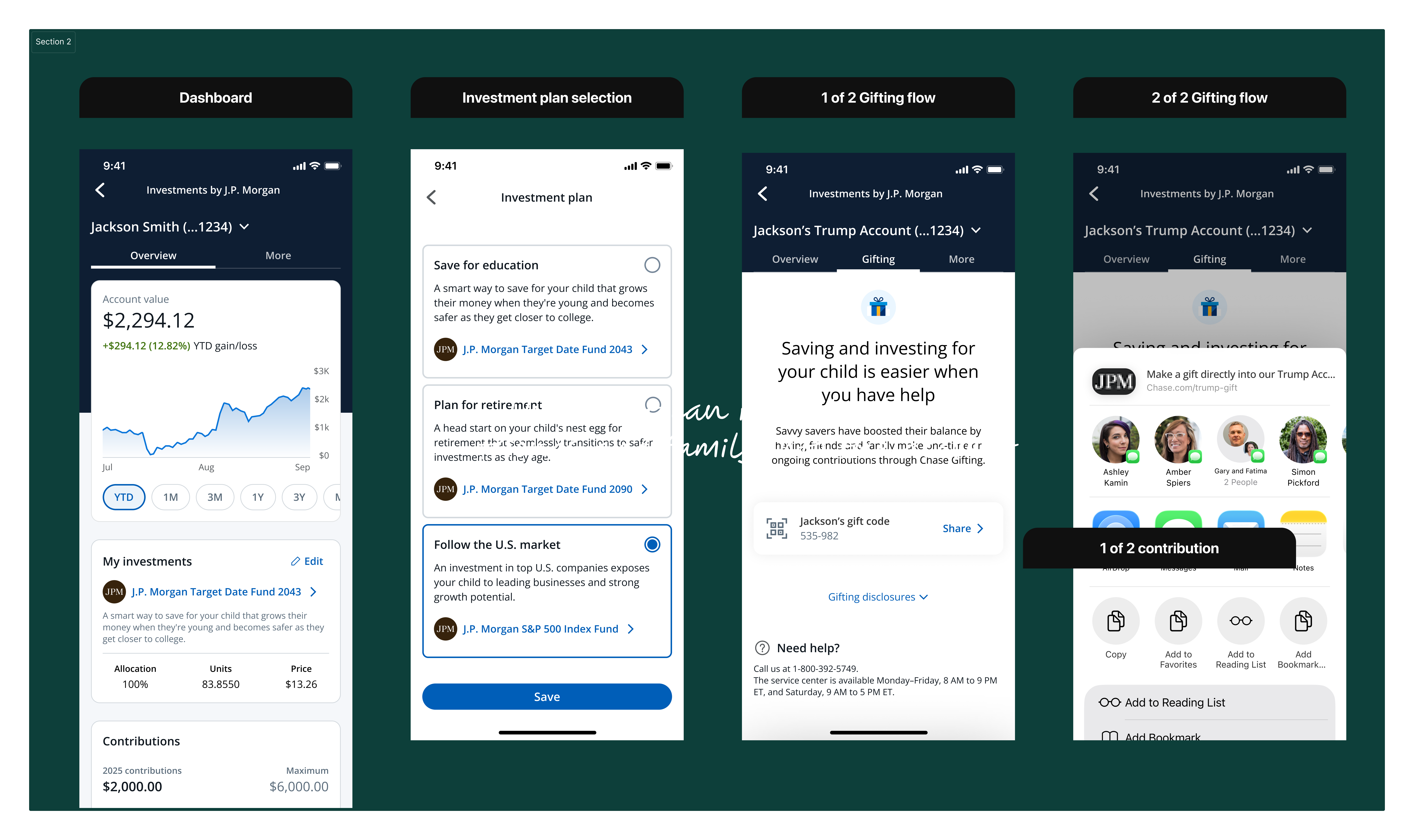
Product leadership wanted to include a gifting feature — a natural addition, similar to how 529s work. I pushed back: gifting wasn't in our capabilities yet. Pitching a feature we couldn't deliver to the U.S. Treasury wasn't a risk worth taking. One conversation. We left it out.
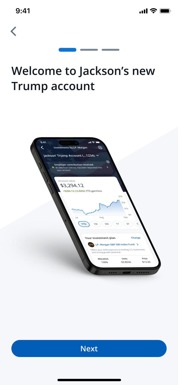
Most clients arriving at this product had heard of Trump Accounts but didn't understand them. Eligibility rules, the $1,000 seed, contribution caps, and IRA-style mechanics all needed to be translated into language a busy parent could parse on a phone. Educational moments were embedded throughout the flow, not isolated to a help section, so clients could learn in context without breaking stride.
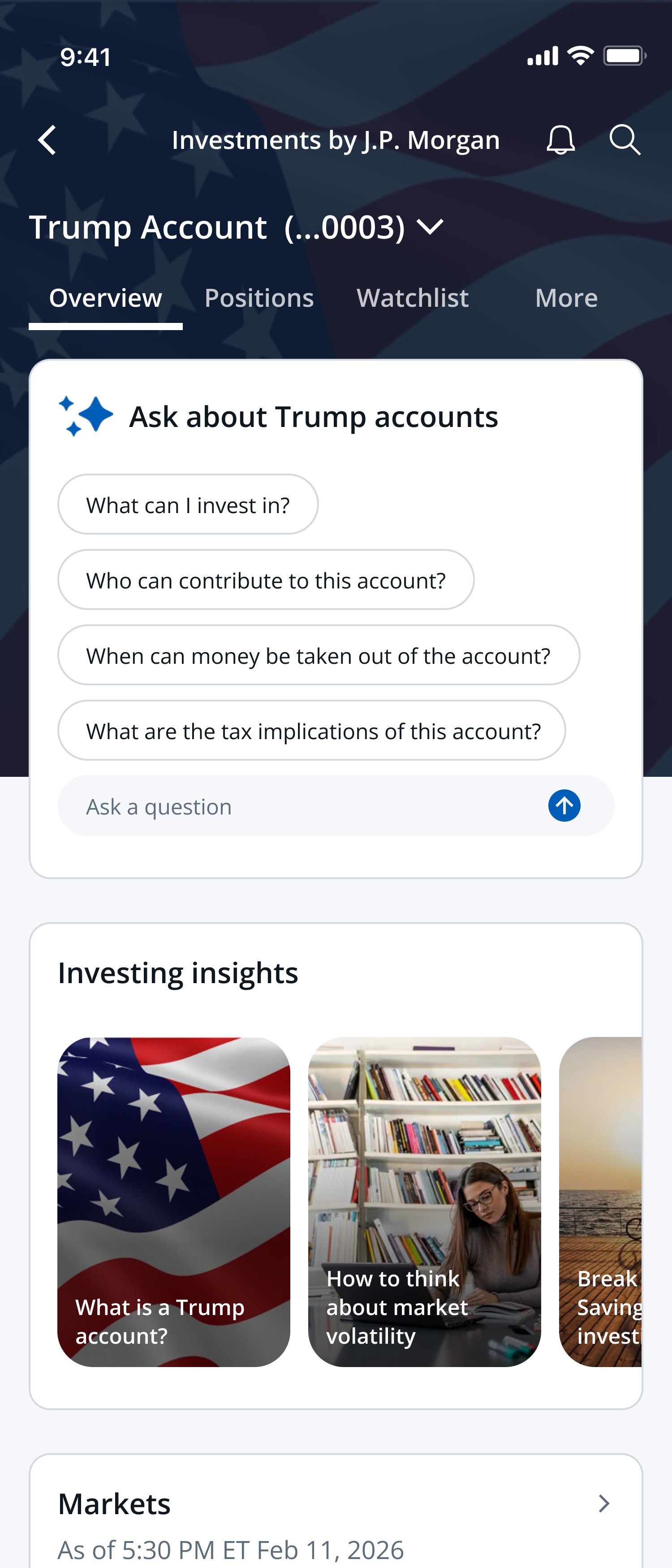
For a product this new, clients would have questions we couldn't anticipate in static copy. An AI-powered chat experience lets clients ask anything: how the $1,000 seed works, whether their employer can contribute, what happens when their child turns 18, or how this compares to a 529. The goal was to give every client a knowledgeable guide, on demand, without picking up the phone.
Trump Accounts are unique in that contributions can come from multiple sources: the client themselves, an employer, the U.S. Treasury, or a charitable organization. The dashboard makes this transparent by default, showing a clear breakdown by contributor alongside projected growth at age 18. Clients should always be able to answer the question: how much is mine, and where did the rest come from?
Trump Accounts restrict investments to low-cost U.S. index funds, but within that, clients have real choices to make. The experience surfaces those choices clearly: what they're invested in, how it's allocated, and how to adjust it. For clients new to investing, this is often the first time they've actively managed a portfolio. The design treats that as an opportunity, giving them the language and tools to feel in control without feeling overwhelmed.
From the first eligibility check to managing an investment strategy, all in one place. Every step designed for a client who is new to investing and new to this product.
A two-week sprint produced the vision that became the reference for production. The work moved three orgs onto a single plan and gave JPMorgan a head start in a market where every brokerage was starting from zero.
The sprint output became the reference for the production build, with the core pillars carried forward intact.
Facilitating across product, design, and tech compressed what could have been quarters of alignment into days.
In build for launch alongside the federal program rollout. The work set the foundation for what the finished product will become.
I was slow to recognize the urgency at the start. Once I understood the stakes, I took a more proactive role leading the daily sessions and that's when alignment accelerated. I wish I had stepped into that role on day one instead of waiting for the pace to force it.
I also wish I had leaned on external AI tools to generate concepts faster. Our internal capabilities were limited at the time, but in hindsight I could have used available tools to compress the iteration cycle even further. That's something I would do differently today.